A residency at Couleur Studio #1
Couleur studio is a gateway into printmaking and thrives to introduce this art form to a broader audience. Which means teaching printmaking to complete beginners but also work with experienced professional artists who don’t use print as their main medium.
In that spirit, the studio hosts short residency, and Eric Jong was the first artist to participate in this program.
Coming from Australia but having lived in the south of France and enamored by the landscape in Provence, Eric decided to do a print inspired by the iconic mountain St-Victoire. A real landmark around Aix-en-Provence, the mountain St-Victoire was painted obsessively by Paul Cezanne during his years living and working in Aix.
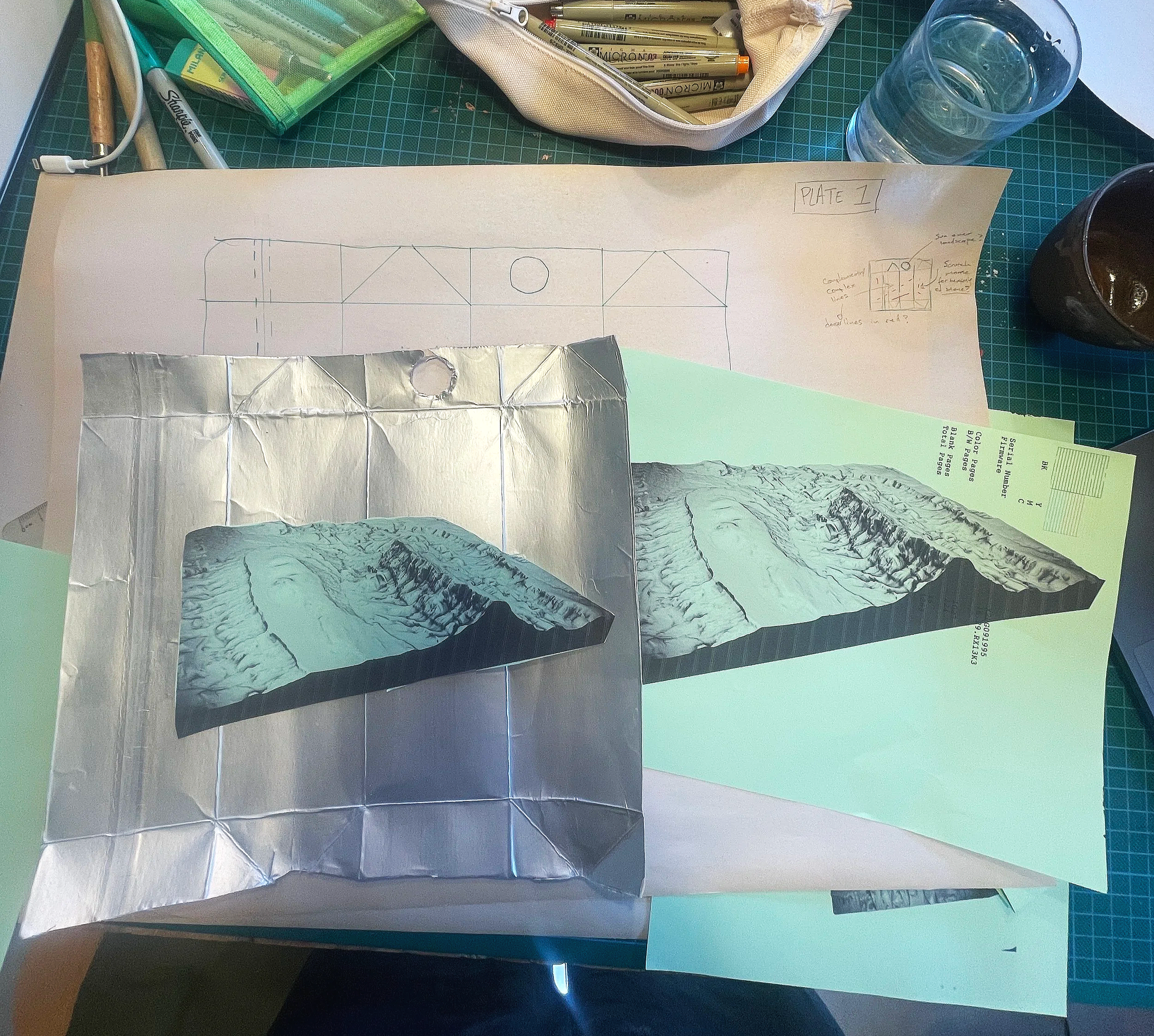
Eric works primarily with digital medium, 3D modelling and projection. So to get started on a 2D print project, we started from his own exploration of landscape in 3D modelling. Exporting a topographic 3D modelling of the mountain, Eric adapted this as a 2D drawing first.
The limestone nature of the mountain makes for some dry, bushy, rocky Mediterranean landscape. The textures are rough and catches the Provence light in an unique way. To render this, Eric chose to adapt his drawing for a milk carton etching.
Milk carton etching is an experimental etching technique that uses recycled material and is a favourite at the studio. It’s affordable (upcycling ! ), easy to source and can be printed in a pasta maker for a real kitchen printmaking vibe. We believe that it’s a wonderful technique for beginners and gives beautiful results. The ink on the surface of the plate, makes for some beautiful texture that we thought was perfect to emulate the rocky landscape of the mountain St-Victoire.
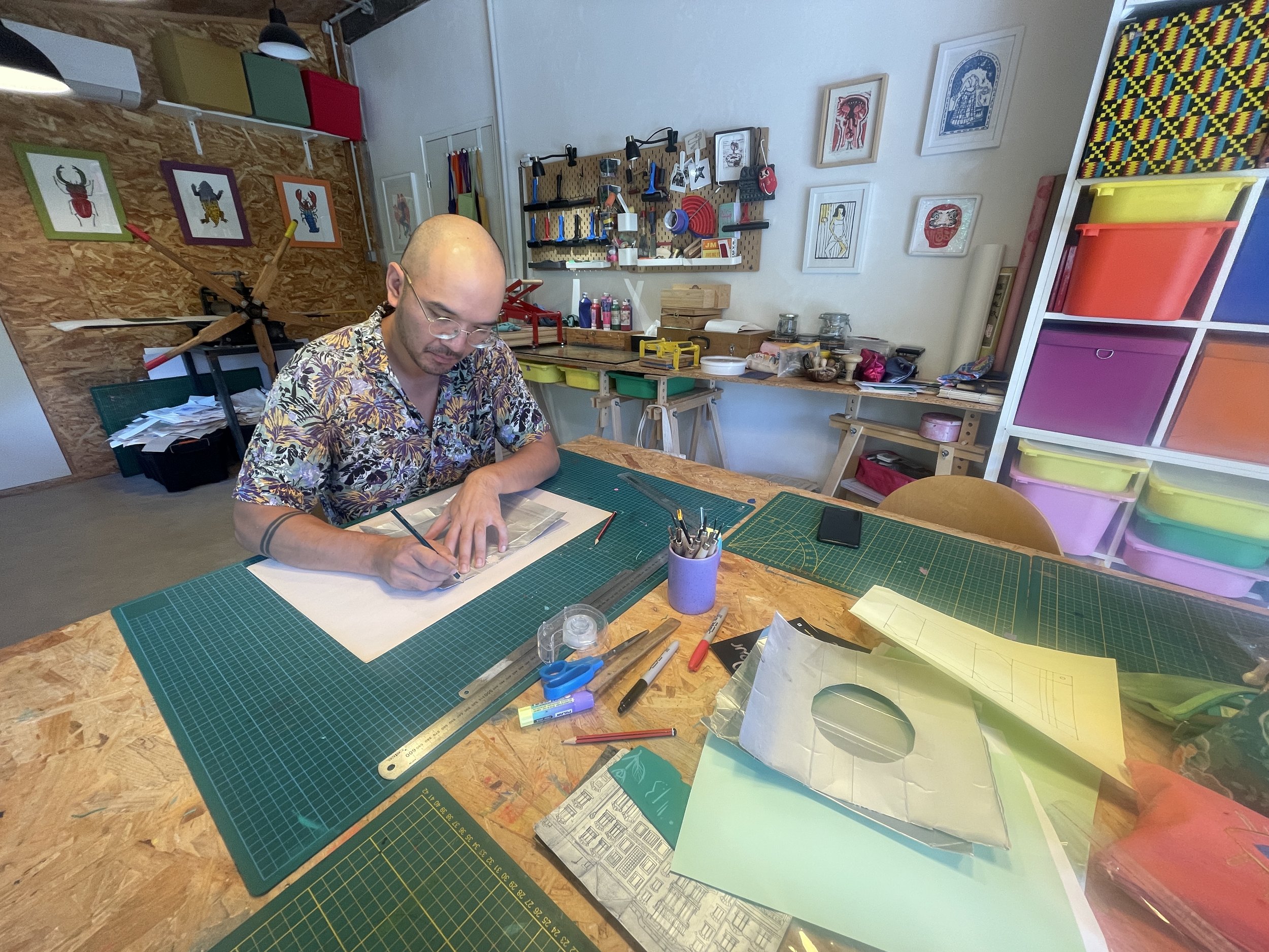
I taught Eric how to transfer his design onto the milk carton plate, using 4B bold greasy pencils and rubbing off the pencil mark onto the plate. This has the benefit of flipping the design in a mirrored fashion, which will then flip back the ‘correct’ way once printed.
Once the design is fully transferred onto the milk carton, it’s time to etch it. For this technique, we use a dry point, which is the same tool used on metal or perspex for the same technique. But milk-carton is soft and easy enough to etch with a simple tool. One doesn’t even have to use a printmaking dry point, but any pointy tool will do, and I often use the tip of a compass to work my plates.
As Eric's design was quite intricate, etching was a time consuming, yet meditative process. For an artist mostly working in digital medium, going back to a slow, hands-on process is often a pleasure and the studio is conducive to slowing down and enjoying the focus of a repetitive task.
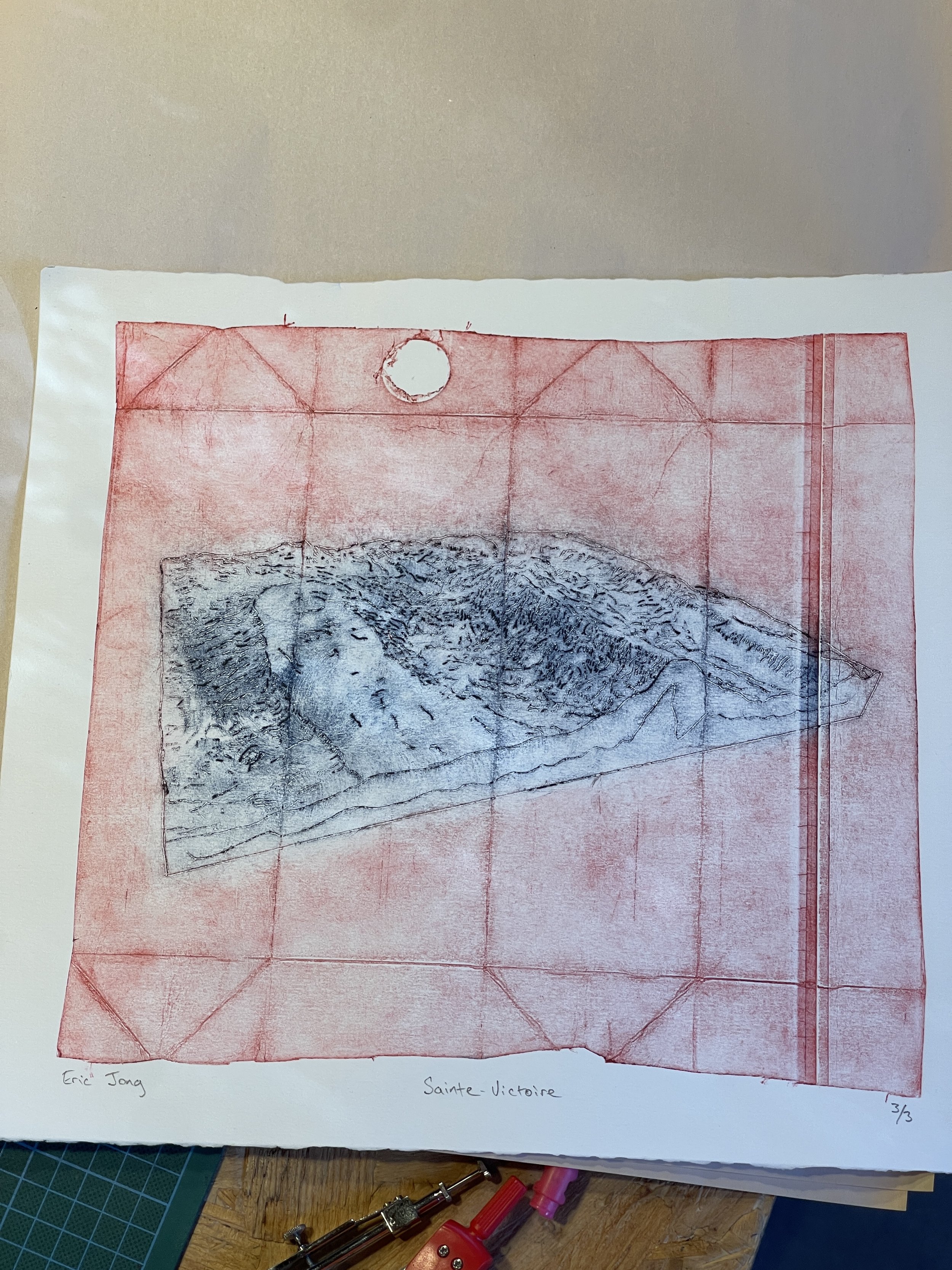
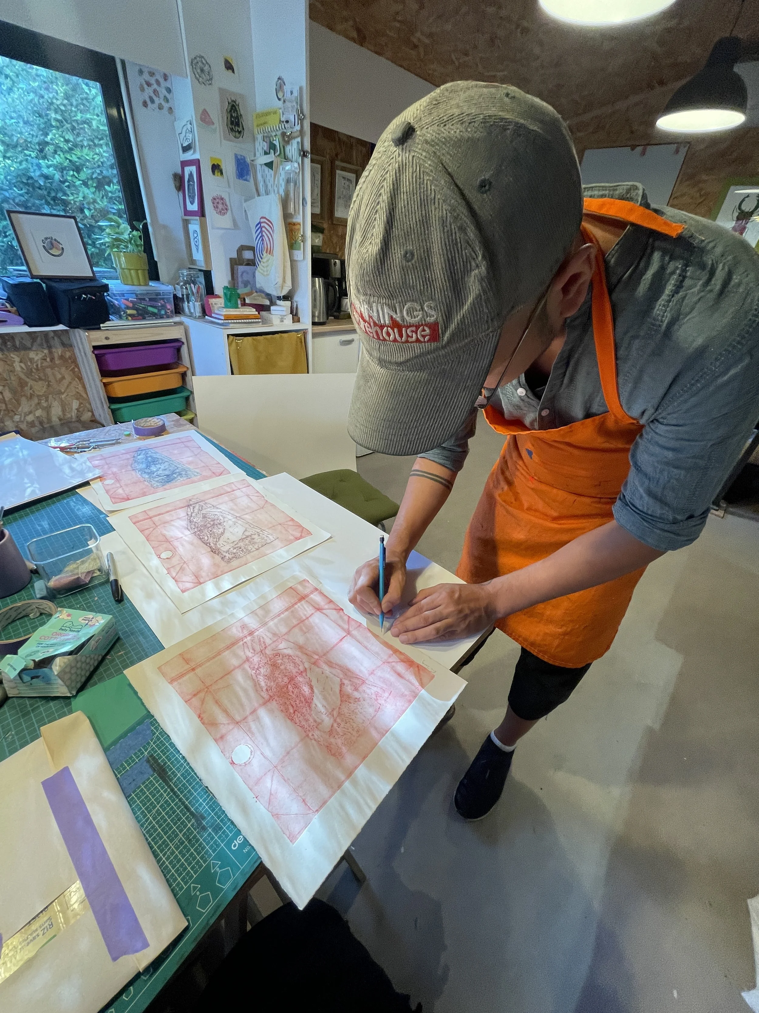
We decided to work quite large and keep the whole milk carton, which means we would see the folds of the box when printing. Creating long panels dividing the image, the milk carton edge and marks all show and add some unpredictable texture that makes for a very mysterious image. The carton we used also had a large hole where the plastic pouring tip was. Once removed, it leaves an empty circle in the plate that will appear white when printed. This also participates in creating an enigmatic image and speaks to the nature of the medium used for the print.
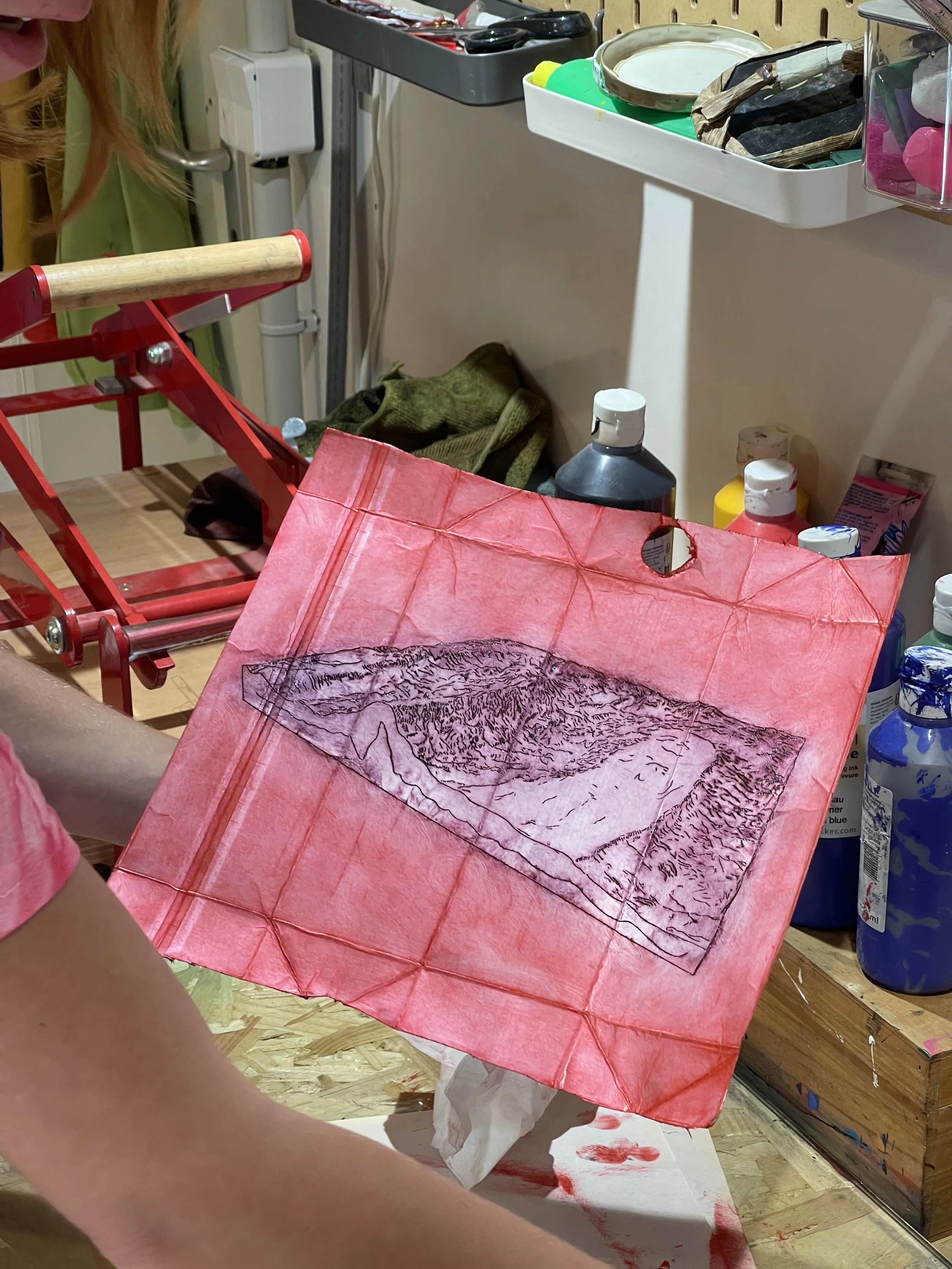
Emilie Inking the first test print in red - Video credit Eric Jong - 2025
The inking process is where I can really help artists with my skills and expertise. We went for a bright red colour for the first print, choosing purposely an ‘odd’ colour for a landscape. The mountain St-Victoire has been depicted so many times and trumping expectation with an usual representation of the local landscape was fun and exciting. After a demo and a test print, I did let Eric try his hand at the inking process. This step allows for a lot of creativity : add or remove ink in some places, fully rub off some areas for some white highlights, keep a lot of textural ink in some other parts and even try out different colours on different parts of the image.
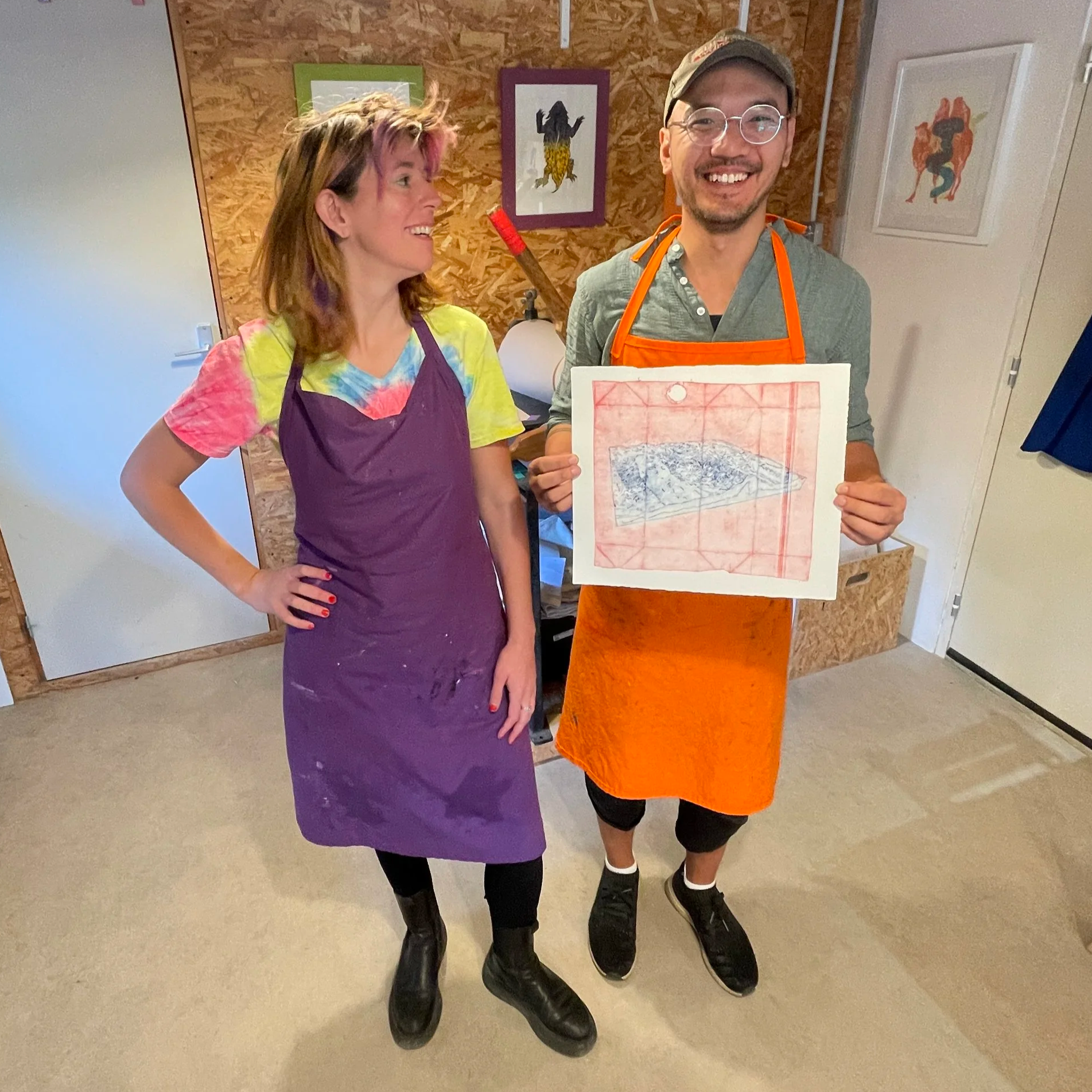
Eric went for a high contrast red and bleu version of the print that turned out to be very effective. The bleu ink on the etched part of the design, stands out strongly on the red textural background! Wonderful colour combination!
Because the plate was quite large, we didn’t print in the pasta maker but rather in the large etching press! This one doesn’t rotate that often in the studio these days, and it’s always fun to see it in action!
Once the small edition print was completed, it’s time for Eric to sign and number his edition of print. This is always a very satisfying moment when we get to admire and reflect on our work and feel pride in the final work !
Well done! Come back soon to Couleur !
Follow Eric Jong on instagram @roundabouthere


